 |
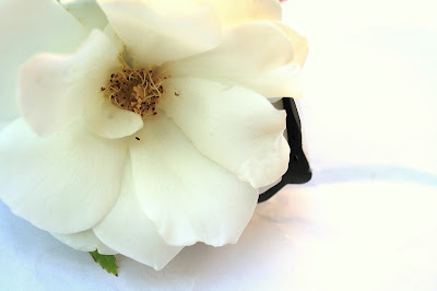
The name is this photograph is The White Bloom. The assignment in my Photo 1 class was to
take multiple of photographs representing the 12 different color studies. We were
to show the color relationships in the photographs taken. For this photograph, I
placed a bloomed white rose inside a white drainage pipe and closed in on the
flower to show the white on white. I used a Canon EOS and shot this photograph
outside of my home. Compositionally this photograph is set up in the rule of
thirds with the white rose cut off at the sides so it looks more visually interesting.
I like this photograph because it shows beauty can be placed anywhere and make
the whole situation beautiful. I really like how the rose is open so the detail
inside of the flower can be seen.
|
Hello! Welcome back to our Photo 1 class blog. Todays post is all about
COLOR. We have chosen our best color photograph from our Color Studies project and written a short artist statement to accompany it. Enjoy!
 |
| Brichelle Anderson |
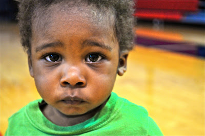
The best Photo I’ve taken in this Color Relationship project,
The Boy of School. I took this shot with a Nikon D-80 in auto mode. This is
photo of Zach Berry in the 10th grade at Bishop Dunne High
School. This photo shows the Warm Cool
Combination color relation. I edited this photograph first using Adobe Bridge,
then using adobe Photoshop. I turn up
the Brightness, vibrancy, & spot corrector. To take this photograph I went to
advisory where the background and his clothing all fell in to place. I love the
way his face is turn to the side, but how you can enjoy the sight of his pretty
green eyes. It’s a peaceful shot, and rather urban at the same time. -B. Anderson
Abby Austin
This photograph is of a gardening
hose in the grass. The assignment in my Photo 1 class was to represent twelve
different color relationships in our photographs, and this photo is showing the
relationship of cool colors. I used my FujiFilm digital camera and shot this
photograph in my backyard. Compositionally the photo is set up with the focal
point to the right with the hose creating a leading line to the focal point. I
like this photograph because of the angle and the way the colors work together.
To edit the photo I used Adobe Photoshop. -Austin
 |
Sierra Wilson
|
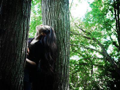
The name of this photograph is Sun Kissed. The assignment in my Photo 1 class was to take pictures following a certain color scheme. The trees and a model are used to show cool colors. The cool colors shown in here are the dark browns and the greens. I used my Sony Cybershot Rx100 and shot this photograph in the woods next to the school. To edit this photo, I used Photoshop elements. I changed the color of her shirt from yellow to brown to make the image look more subtle. Then, I darkened the leaves behind her and increased the contrast. Finally, I added a vignette to the photo. Compositionally, this photo is set up with a girl in a tree leaning back, facing the sky. I like this photograph because of the colors and the position of the girl. -Wilson
 |
| Daisy De la Rosa |
The
name of the photograph is “Sweet and Simple”. The assignment in my photo class was to have a
photograph that implements ourselves and the way we are. I used myself in the
photograph. In it I’m wearing a pink shirt,
and slight light pink lipstick. I captured the photograph using a timer. I used the color pink because I think of
myself as a friendly and sweet person.
The type of camera I used was a Sony Touch and I took the picture in my restroom.
It is set up with myself as the focal
point, in the middle. For my photograph
I used Adobe Photoshop, and I leveled up the contrast in the photo, and changed
the hue very slightly. I like this photograph because it’s very simple, just
like me. The angles and lines in the
background work as leading lines. -De la Rosa
 |
| Destini Hunt |
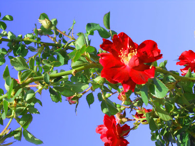
The name of this photograph is called
Red. The assignment in my Photo 1 class
was to use colors that complimented each other.
My red flower is complemented with the green leaves. I used a flower and angled the camera to have
the flowers in the sky. I used my Nikon 3600 Camera and shot this photograph
with my landscape scenery, which was located in the garden at my neighbor’s
house. Compositionally this photograph
is set up in the rules of third with the red flower as the focal point. I like this photograph because it’s simple,
but yet so beautiful. You can never go
wrong with photographing a flower. - Hunt
 |
| Reagan Thomas |
This is my best photo because the
colors are very vibrant; they are in a warm/cool combination. They flowers are
a bright pink while the leaves are a dark green. There is no real focal point in this photo,
but I think the flowers draw your attention the most. This image was shot in my
front yard, and I used my Kodak camera. I used Photoshop to edit this photo,
and, in my opinion, the composition of the photo was well executed. - R.Thomas
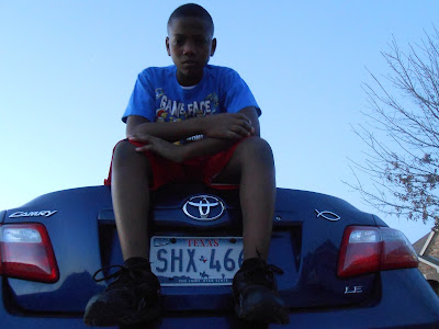 |
| Imani Thomas |
The name of my photograph is serenity. The
assignment in my Photo 1 class was to photograph various color relationships
and edit the photo on Adobe Photoshop CS6. I used my dad’s car and my younger brother to
show the monochromatic color relationship. Monochromatic is where the
photograph has various shades of the same color. I used my Nikon CoolPix and shot this photograph
outside of my house on top of the trunk of the car at around 6 pm. Compositionally
this photograph is set up at an upward angle, my younger brother is sitting on
top of the trunk of the car and I am on the ground capturing the photo under
him. I love this photograph because calm and soothing emotions executed are portrayed
through the monochromatic blue hue. - I. Thomas
 |
| LeBria Ware |
The name of my photograph is “Ballerina Adorned
in Ivory.” Photographed is a white ballet flat on a white background. The
ballet flat is placed towards the right side of the photograph. The intense
shadows within the photo provide depth and draw the viewer’s eye to the shoe. It
was edited in Adobe Photoshop to enhance the shadows in order to separate the
identical colors. The photo was taken with a Canon PowerShot SX150 IS in my
home. This white on white color relationship fulfills the purpose of this
assignment by contributing to the experiments with the relationship of hues and
colors within a photograph. I like this photograph because even though the
colors of composition are mainly the same, the two are still separated with the
help of shadows. I feel that this picture tells the story of a beginning dancer
who hardly has any experience with ballet. As the dancer gets more experience,
more color will be added to her shoes. - Ware
 |
| Kathleen Goegel |
The name of this photograph is Passion. The assignment in my
Photo 1 class was to take photographs of different color combination. I used a
rose on a rose bush to show warm and cool colors. I used my point-and-shoot
Nikon Coolpix s9050 and shot this photograph in my backyard. Compositionally
this photograph is set up slightly in rules of thirds. I like this photograph
because of the colors and angle of the flower. - Goegel
 |
| Andrew Cardoza |
The
title of this photograph is Spring Bloom.
The assignment for my Photo 1 class, taught by Mrs. Ramirez, was to take
photographs displaying anything to do with color relationship. This photograph
that I took was part of the analogous section, colors that are next to each
other on the color wheel. The two analogous colors that are displayed are
yellow and green. The composition of this photograph is simple; it is set up
with a focal point of a yellow flower following the rule of thirds along with
green leaves running up the stem. The veins of the leaves are acting as natural
leading lines leading your eyes toward the focal point. I used my Canon
PowerShot ELPH 110 HS and I took it in the backyard of my home. I like this
photograph because even though there are more colors then the analogous green
and yellow, the focal point is of those two colors. Also, to me, it seems like
the flower is opening up to the world. - Cardoza
 |
Osahon Agbon
Art is a
never ending challenge, it is a constant struggle to astonish and amaze not
only yourself, but every person that will eventually see your art work. In order
to amaze my audience, I always seek to improve my skills and to surpass my previous
work. In my photograph titled “Secondary
Basics” I use secondary colors as an example to fit in the theme of color
relationships for my Photo 1 project. With my handy Sony Cyber shot DSC camera,
I attempted to improve my photography skills by reminding myself of a very
important life lesson, to always try to keep life simple. In my photo, the
crayons function as leading objects to my focal point of the colorful zigzag
line. I love and chose this photo
“Secondary Basics”, because this art work proves my idea that the most beautiful
things also have a sense of deep simplicity
|
 | |
| Joseph Bianco |
The name of the photograph is "Blue Christmas. The assignment in my Photo1 class to bring out the natural colors that we see in everyday life. I used ornaments and a trash can in order to bring out the the monochromatic shades of blue. I used my daddy's DSLR camera to take pictures in my house! Exotic, I knwo. I just knocked over the trashcan, and the balls rolled out; it worked out better than i thought. I LOVE this photograph because its BLUE!!
 |
May Cantu
"Spring Beauty"
I used my favorite photograph from my Color meaning project
from my color personality snap shots. In this photograph there are bright light
pink roses waving in the wind by my neighbor’s house. Above you can see the
bright blue sky with fluffy white clouds. This photo took little editing
because all the colors came out so clear and bold and beautiful. It was my
favorite photo because it contained each of my personality colors, one color
warm and one color cool. I used a Sony digital camera.
Alesia Johnson
"Taste the Rainbow"
My photograph titled, “Taste
the Rainbow” depicts many emotions, depending on how you visually see it. My assignment
in Photography 1 was to take different color relationships within my photographs.
While taking this photograph, I had one simple objective in my mind. Keep it
simple and childish. I wanted something exuberant and possessed a childlike innocence and
hunger for a sweet tooth. I used my
little cousin Tayler to show my relationship between warm colors. I used my
mother’s Nikon camera and shot this photograph in my room, while she had come
over. I was so lucky she decided to drop by!
Usually, I try to apply my rule of thirds for my focal point. However, I
myself did not have Tayler as the focal point, but rather the cup of skittles.
So I told her to slant her hand toward me so that the glass, hit that rule of
thirds perfectly. I really do like this photo because even in its simplicity it
just makes me happy. Children and candy make me happy, so what better way than
to combine two things I loved?
 |
| Lizzy Spradlin |
|
 |
| Aaron Shofner |


 The name of the photograph is "Blue Christmas. The assignment in my Photo1 class to bring out the natural colors that we see in everyday life. I used ornaments and a trash can in order to bring out the the monochromatic shades of blue. I used my daddy's DSLR camera to take pictures in my house! Exotic, I knwo. I just knocked over the trashcan, and the balls rolled out; it worked out better than i thought. I LOVE this photograph because its BLUE!!


